Give a round of applause for the avocado – and for excellent typography & photography.

This spread was designed for what appears to be the Summer 2014 issue of ‘Foodie for Thought’ magazine, written about the positive affects avocado can have on a diet. I chose this ad because the typography and photography give a clean and modern feel, and you don’t have to search too much to see what the focus of the article is.
Designed by: Becky Samowitz | Published: March 16, 2014 https://issuu.com/beckysamowitz/docs/beckysamowitz_avo_mock_spread
ANALYSIS: CATEGORY IDENTIFICATION

The first typeface that the eye is drawn to is Sans-Serif in the title, subtitle and first letter of the article. It is easily identified by the absence of Serif and the mono-weight, in that there is no thick to thin transition in the strokes. The body font is Oldstyle, identified by the presence of serif, the serif being slanted, and the thick to thin transitions on each character.
ANALYSIS: CONTRASTING TYPEFACES

The biggest contrast between the two typefaces is the obvious difference between the serif in the Oldstyle and the sans serif. The sans serif gives a crisp and clean look and feel to the design, while the Oldstyle gives a more professional look, giving readers the feeling that the author is knowledgeable about the topic. These two typefaces contrast enough that the eyes don’t just slide down the page; there is a definite change between the title and body.
ANALYSIS: RULE OF THIRDS
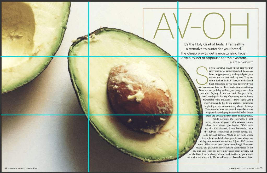
The designer here uses the rule of thirds for her spread to focus in on the avocado, the star of the article. The avocado touches all but one of the 9 squares, and the seed is in the very middle square, giving it a strong presence.
MY PHOTOGRAPHY:
I did choose the photograph avocados in all three of my photos because that is what the article is about, however I did try to show it in different ways.
The first photo is the avocado cut in half, showing the seed, just like the photograph in the original ad. I kept the seed in the middle of the photo, using the Rule of Thirds to focus on the subject – the diva avocado itself. I continued to use the Rule of Thirds with the avocado toast, and the avocado cutting board, continuing to make the avocado the focus of the photographs.


CONCLUSION
I chose this ad because of how much the avocado jumped out at me; my eyes zeroed in on the avocado seed immediately because of the excellent use of Rule of Thirds by the photographer. Some might say that the colors don’t contrast well enough, or that the brown and green mix a little too much, but I think that because the avocado seed is so front and center the ad stands out very well. The two typefaces contrast enough that the reader can easily transition from title and subtitle to the article body. I believe the Sans Serif font was a good choice for the title because it looks clean even though it is large, while the Oldstyle works well as the article body because it’s not very distracting, making it easy to read. The skillful use of contrasting typography and rule of thirds in this ad deserves a round of applause.
